
How to use the Options Explorer
How to use the Options Explorer

Background
The existence of call or put options walls can be considered a contrarian indicator. The logic behind this is clear: if you have sold large volumes of options which will become payable you may be able to reduce your costs by moving the price of the underlying equity to the other side of the strike price.
The Options Explorer1 takes this a step further, enabling us to see the cumulative effect of all calls and puts: clearly it is of no benefit to an options seller to avoid paying out on calls if they then have to pay out on puts instead.
Usage
The Options Explorer has been designed to be very easy to use. Open your browser and go to the address you’ve been given. You’ll see a screen like this:
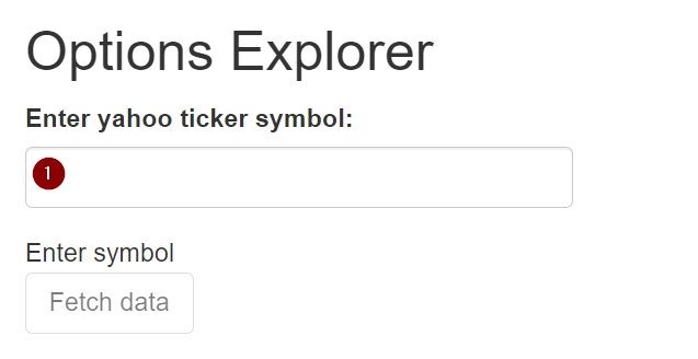
Enter your ticker of interest (as known to Yahoo Finance: you can check it here) in the field (1). The current quote price and time will be displayed:
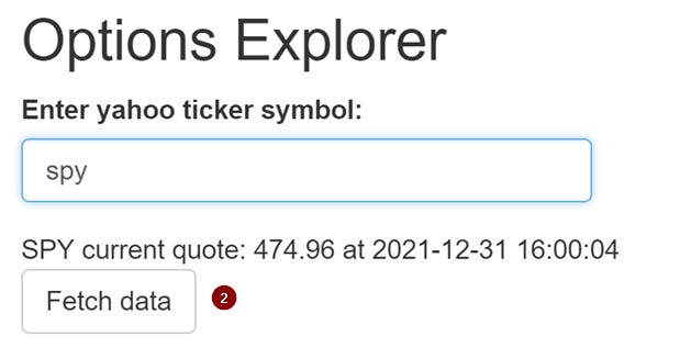
Click on “Fetch data”, (2), to fetch the data. This may take up to a minute if the servers are slow. Confirmation is displayed in a status line below the button.
As soon as the data has been loaded, two graphs will be immediately displayed. The first id the options summary for the next six weeks:

And the second, the options details for the following Friday:
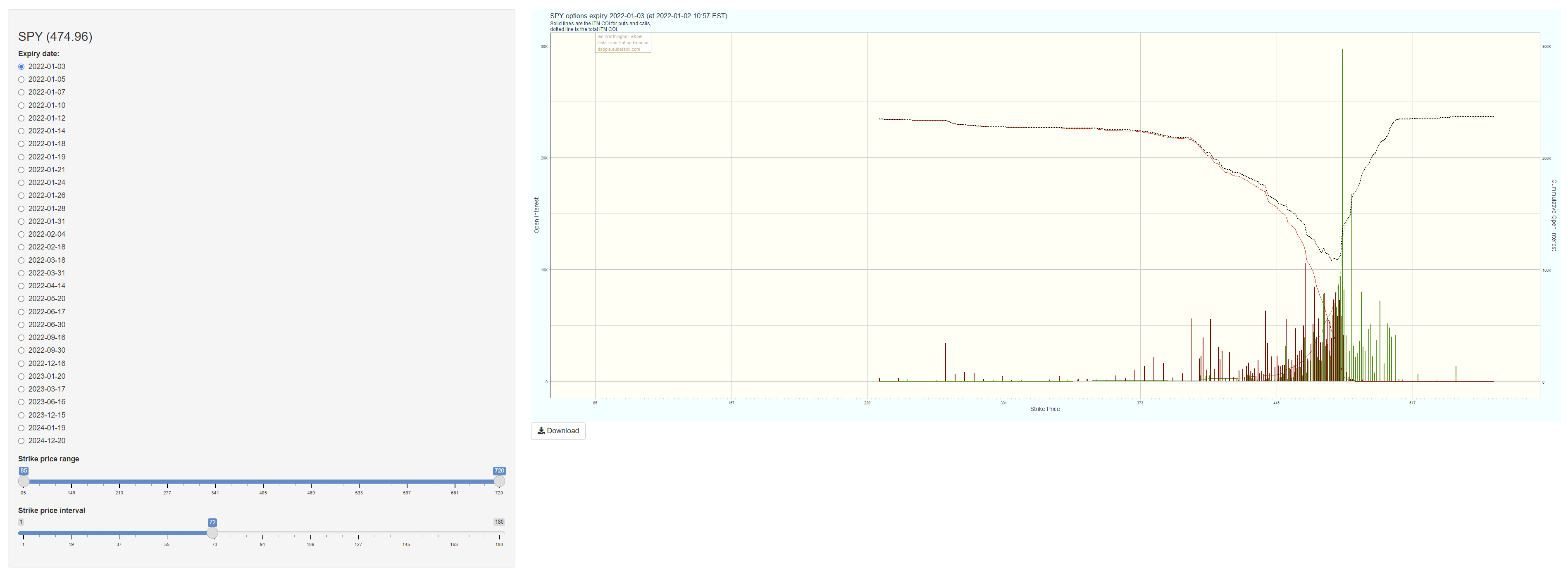
Both graphs work in the same way: in the lefthand sidebar select the date of interest and modify the presentation using the sliders:
Strike price range: Drag the sliders to set the minimum and maximum prices of interest. The range available covers all prices of all strikes for all dates.
Strike price interval: Drag the sliders to set the interval of the price labels on the horizontal axis.
Scale: On the summary plot only, this changes the vertical height of the ridges.
Finally, there is a Download button immediately underneath the graph so you can save a high resolution copy.
Interpretation
When considering the cost curve, it is important to consider the full context. Moving an equity price is not without cost nor risk, and needs to be balanced against the cost of paying out the options contracts. If the cumulative open interest is low (as it sometimes is, especially if it’s not the third week of the month), the equity price must be moved across major levels of resistance or support, or a closely following expiry requires a different movement, then it may be cheaper to just pay out.
The Options Explorer helps us to see this context. The first chart presented is an overview up to the selected date. In this example we can clearly see that the OI for the 21st January and 18th February dwarf that of the other weeks:
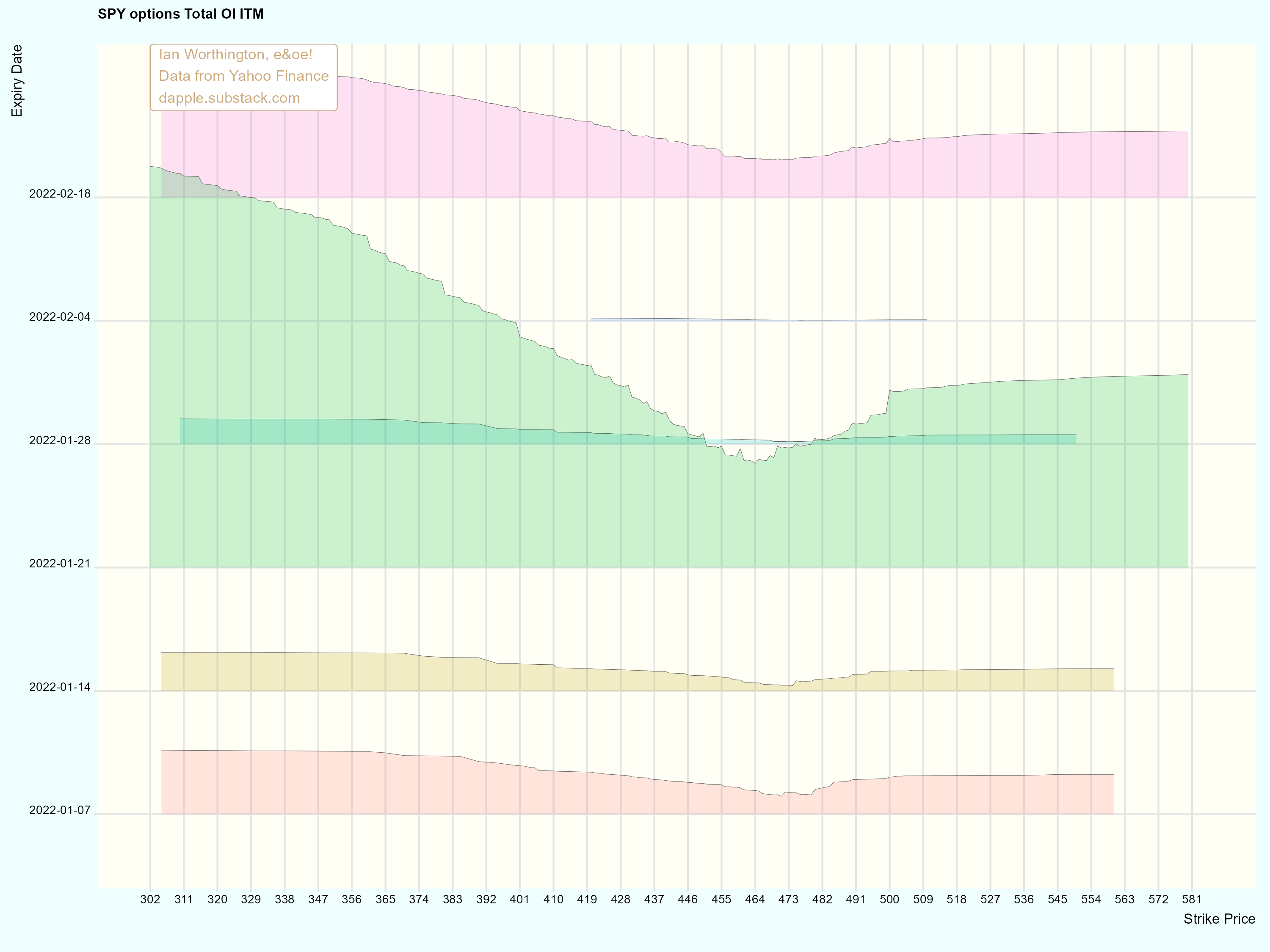
The second chart allows us to see the OI for each call and put strike price (the vertical bars), showing clear walls. The red and green lines show the cumulative OI for each strike price, and the dotted black line shows the total ITM cumulative OI:
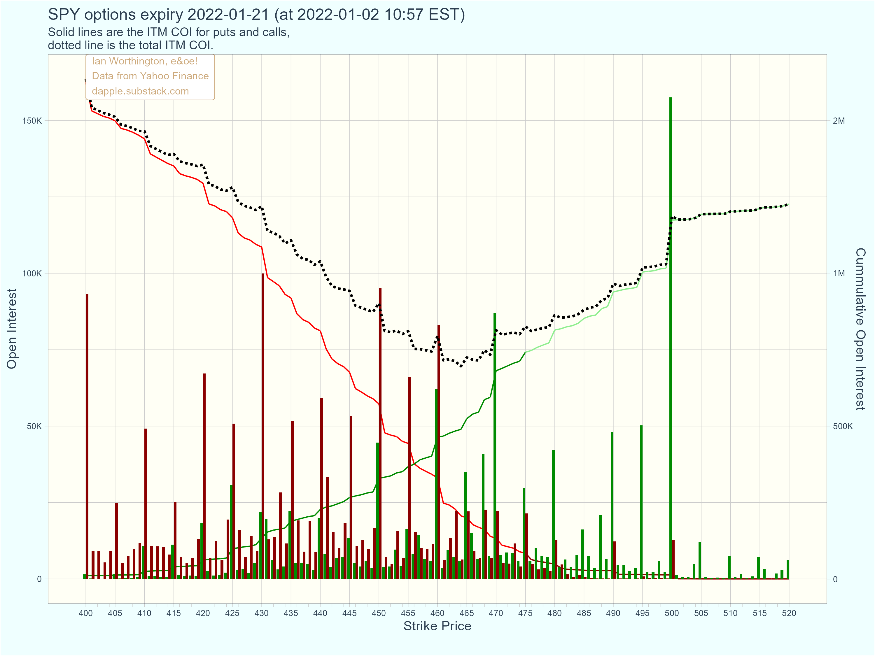
From the total ITM COI line, we can see that, as of the analysis date, options sellers would prefer to see a market close in the range 460 < $ < 465 but that up to $5 lower might be ok, and that more than $5 higher might start to become expensive.
Bear in mind that this expiry date is 15 trading days away and we should expect to see some movement between now and then. This can be tracked using the Options Explorer.
The Options Explorer is an interactive analysis tool available from myself. Details will be announced shortly.